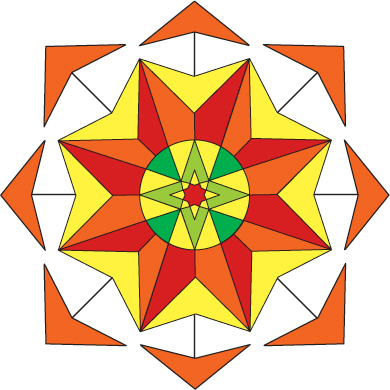
If you have ever noticed Wellness At The Center’s logo and wondered why, let me tell you. The symbol represents an interaction between the eight directions with an energetic center. The colors are from the traditional Tibetan Buddhist’s robes and headdress and symbolize conscious and grounded being-to put it briefly in my own words. Chinese Medicine is rooted in the Ti betan traditions and there is much overlap in symbolism between the two. The exterior is selectively permeable and protective enough to effectively discriminate what may pass the initial layers, although vital energies are allowed through and may permeate to the very core.
This symbol is one of intrinsic flux and change. With stability inherent in the design, is meant to impart conscious intelligence within its very structure. This is not so different from our own beings when we are healthy and stable. It also bears commonality with the nature of the Tao- the weft and wane of the universe itself. Thank you to my husband, for taking these ideas and giving them shape.
Colors each represent different ideas and have their own different energetic signatures. For more on the Tibetan traditional interpretation of these colors see: http://www.colourlovers.com/blog/2007/08/20/colors-of-religion-buddhism
